Mini Program Design Guidelines
Colour
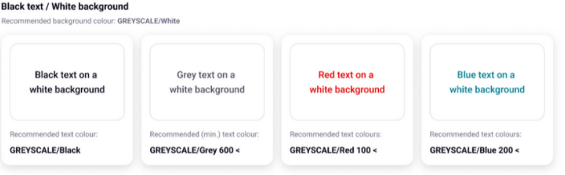
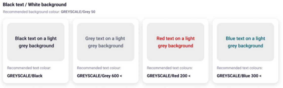
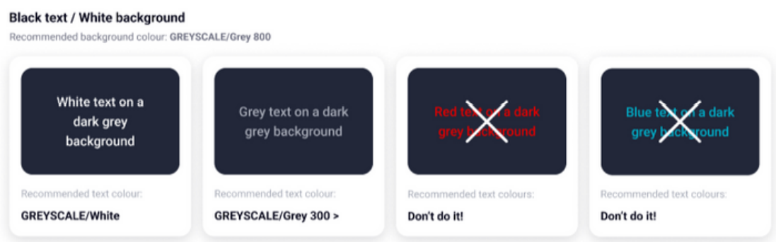
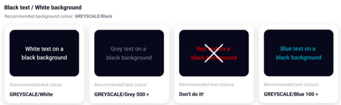
Text colours that meets the WCAG standards
Use these text colours to make sure your design meets the minimum colour contrast ratio of 4:5:1
Typography
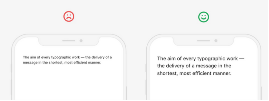
Without a doubt, fonts are one of the most critical elements of UX
Roboto was interestingly chosen by Google as the main font for its mobile operating system on Android phones, making it a popular choice as a font for app UI design. Roboto font can be used in any operating system.
Recommendations
- Don’t use a font size less than 16pt for the Body text in your app design. A good size for the body text will be in the range from 16pt to 18pt
- To make the typography of your app more accessible on iOS, you can apply Dynamic Type Sizes.
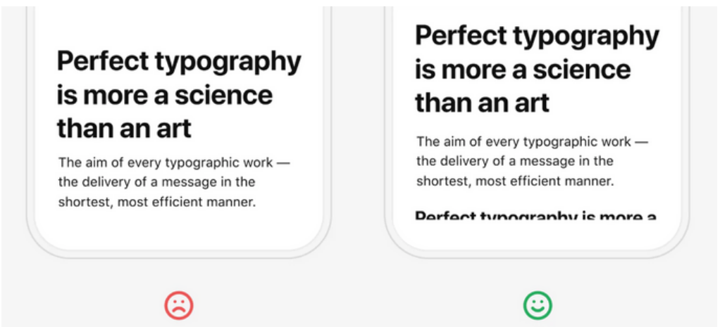
- Choose a headline size both contrasting with the body text and fitting on average 2–3 lines.
- Use the Stark plugin (or other same plugins) for Sketch, Adobe XD and Figma or online contrast testing tools to check your text contrast.
- The easiest and most common way to add accents and a unique look for the typography of your mobile app is using a system font for the body text and various controls and a non-default font for headings.
- Compose the layout so that part of the content was above the fold, thereby showing the user that there is more content and encouraging them to scroll.
Layout
Design layouts use uniform elements and spacing to encourage consistency across platforms, environments, and screen sizes.
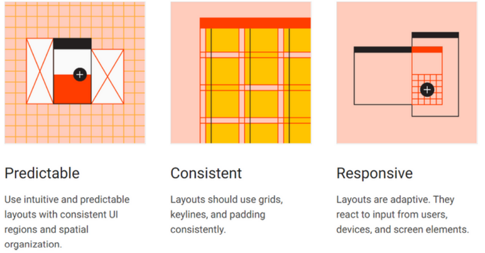
Recommendations
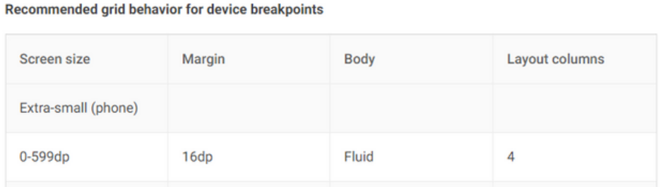
- When creating a responsive layout system, it’s helpful to establish minimum and maximum dimensions for the body and margins, as well as scaling behavior that allows each region to adapt to different form factors
- The body region is used for displaying most of the content in an app. It typically contains components such as lists, cards, buttons, and images.
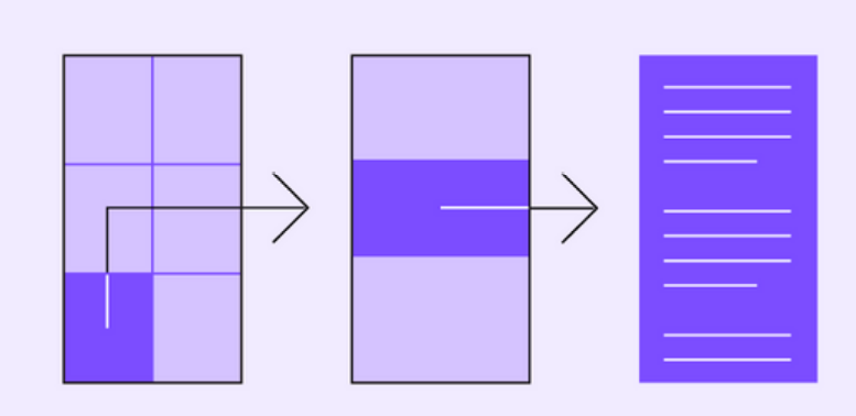
- The responsive column grid is made up of columns, gutters, and margins, providing a convenient structure for the layout of elements within the body region. Components imagery, and text align with the column grid to ensure a logical and consistent layout across screen sizes and orientations.
Iconography
Product icons are the visual expression of a brand’s products, services, and tools. Your app icon is the first thing a user will see when interacting with your brand.
Why use icons?
- Icons are potent communication devices.
- Icons break language barriers and provide a better user experience than when text is used alone.
- Icons are functional elements
- Icons should not be used as decoration elements. It must always convey a message.
- Icons aid navigation
- Icons help users navigate your app. When used correctly, users will be able to navigate the app independently of the text.
- Icons grab the users attention
- By breaking up big blocks of text on a pages, icons add visual interest and helps sustain the users focus when navigating on the page.
Navigation
Navigation enables users to move through your app
Navigational directions
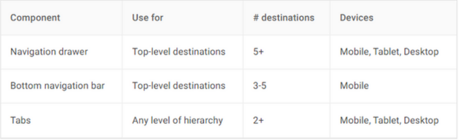
Based on your app’s information architecture, a user can move in one of three navigational directions:
Lateral navigation refers to moving between screens at the same level of hierarchy. An app’s primary navigation component should provide access to all destinations at the top level of its hierarchy.
Forward navigation refers to moving between screens at consecutive levels of hierarchy, steps in a flow, or across an app. Forward navigation embeds navigation behavior into containers (such as cards, lists, or images), buttons, links, or by using search.
Reverse navigation refers to moving backwards through screens either chronologically (within one app or across different apps) or hierarchically (within an app). Platform conventions determine the exact behavior of reverse navigation within an app.
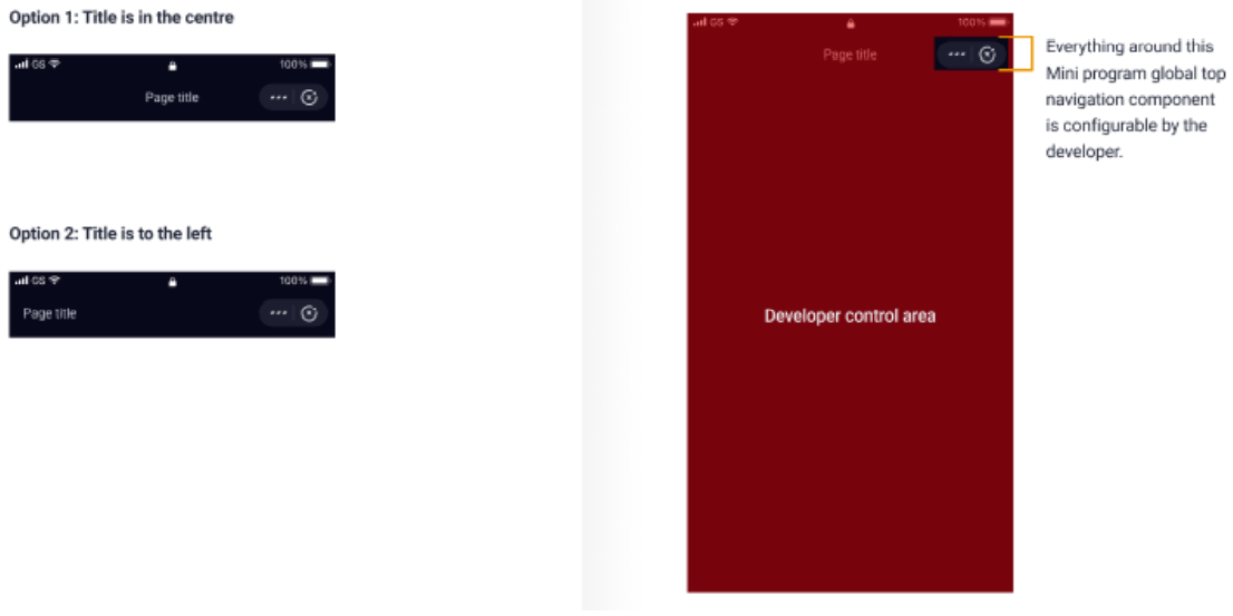
Mini Program top navigation
The nav bar appears, in a fixed position, on all pages of a Mini Program, including embedded web pages and plug-ins.
- You can alter the title alignment left or centre, depending on your design requirements. Please also see the ‘Back navigation’ section for further considerations, especially for iOS devices.
- Please ensure any interactive elements around the top navigation area do not interfere with the operation of the Mini Program navigation elements.
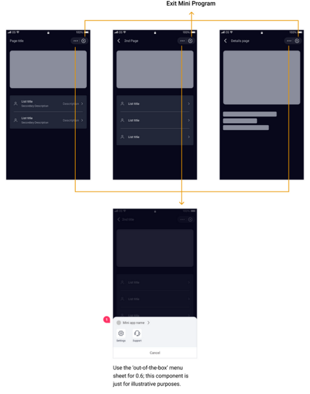
Top navigation interaction flow
Using the Mini Program navigation:
- Tap ‘More’ (Overflow icon) to display menu options relating to the current Mini Program. You can add the details for the ‘Support’ option in the Mini Program Platform.
- Tap ‘Close’ to exit the current Mini Program and return to the VodaPay dashboard.
- Tap ‘Back’ (where applicable) to return to the previous level.
In-page navigation
You can add your own navigation in the page to meet your functional design
requirements. Make sure that you maintain consistency in navigation actions across all
of your pages so that your users find it easy to move within your mini program.
Keep your Mini Program page navigations simple and easy, and visually distinct from the official navigation, so your users can easily see the difference.

Back navigation
It is essential for users to be able to navigate back to previous pages. On Android
devices this is catered for, however for iOS this is not built into the device navigation. As
such, in order to provide consistent journeys and capabilities, the back arrow should be
included in the top header navigation.
The most important aspect to remember is to
ensure that users:
a) know on which page they are.
b) know how to navigate back.
Therefore, it is very important to have the back navigation accessible at all times.
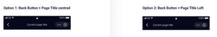
For Android devices: one of two options can be used:
- A standalone back arrow with the current page’s title centre aligned in the header (Option 1) or
- A back arrow with the current page’s title left aligned next to the arrow (Option 2) .
In both cases tapping on the back arrow will take the user back to the previous screen.
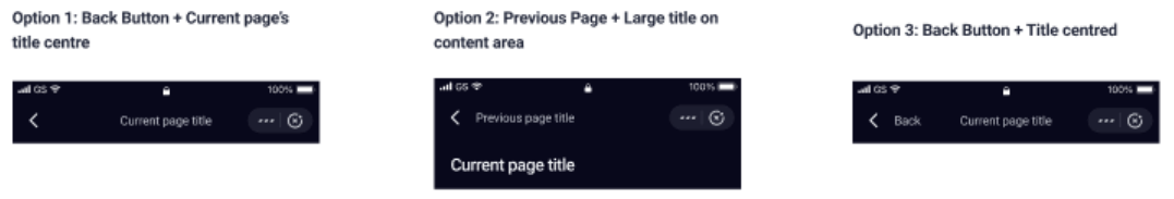
For iOS devices: one of three options can be used, depending on the navigation system
that has been defined.
The three options are:
- A standalone back arrow with the current page’s title centre aligned in the header (Option 1)
- A back arrow with the previous page’s title left aligned next to the arrow and the current page’s title either centre aligned in the header (small title) or placed on the page content area (large title) - (Option 2), or
- A back arrow with the word ‘back’ next to it and the current page’s title either centre aligned in the header (small title), or placed in the page content area (large title) - (Option 3).
In all cases tapping on the back arrow will take the user back to the previous screen.
Bottom navigation bar
It’s always fixed at the bottom of the screen
- Does not scroll/hide along with the page.
- For space and usability, five has to be the maximum number of tabs .
- A single page should only contain one tab bar.
- When a tab is selected, both the text and icon in that tab must be highlighted.
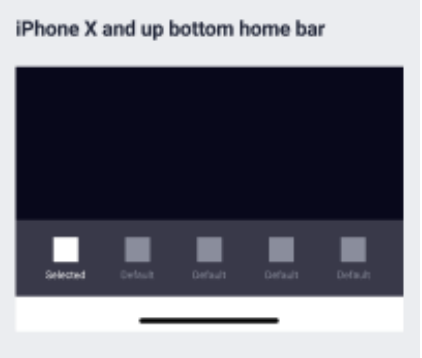
For iPhone X and up, the developers need to cater for the native bottom Home bar. All bottom components within the Mini Program will need to sit above this native Home bar. This is done to ensure tapability of the Home bar component, as well as the bottom navigation buttons. The Mini Program can decide which colour version of the Home bar to use - the core app uses the white version.
Feedback
Sometimes a user will have to wait for a page load or form to send, despite our best
efforts to reduce wait times.
When this happens, offer prompt feedback to inform them, and to reduce frustration and uncertainty. You should also provide clear feedback to inform users about the result of an operation.
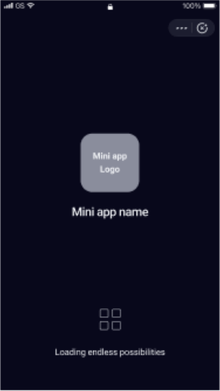
Start-up page loading
The Mini Program start-up page displays for as long as the app is loading, and provides
you with a branding opportunity. Highlight your brand's features or logo and loading
status via a progress indicator.
Apart from the brand logo, the remaining elements such as the loading progress indicator, are provided by default and cannot be altered.
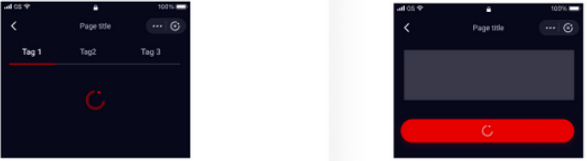
Local loading
Local loading occurs when the loader need only be applied to one area of a page where
loading is taking place. The feedback is focused to a specific area and entails less
movement overall on the page.
To minimise interference with the user’s experience, we recommend ‘Local loading’ over ‘Global loading’ (see next section).
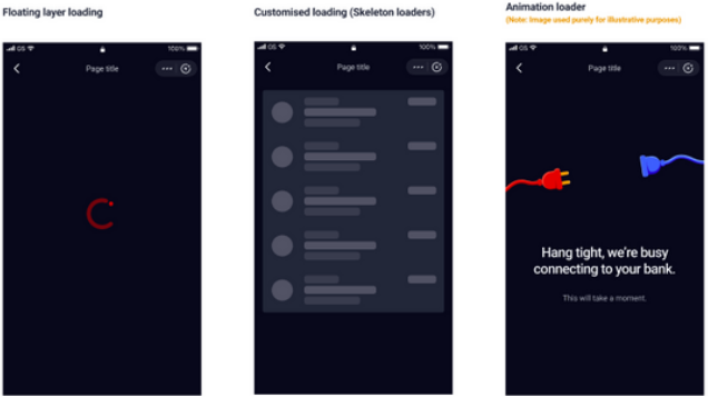
Global loading
Global loading is when the loader is applied over the entire page. Use this with caution,
because it does not allow for clear communication of the location/content of the
loading area, which can cause anxiety to the user.
You can customise the global loading style. We recommend an animation effect to avoid the appearance of a stuck/static page.
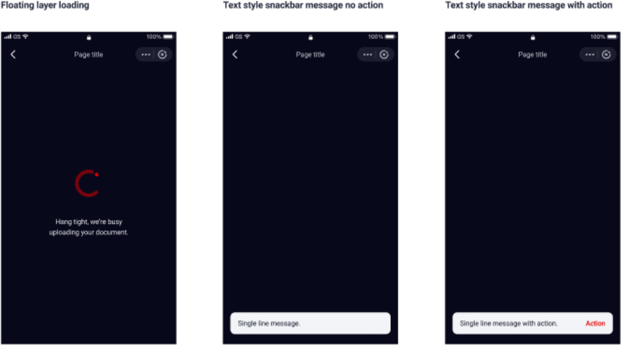
Feedback on global actions
Snackbar messages appear at the bottom of the screen to inform users of a process
that the Mini Program has performed/will perform (e.g. a success notification): they’re
temporary, lightweight operational prompts. They dismiss automatically within seconds,
so they don’t require any action from the user nor do they interrupt the current journey.
Snackbar messaging is NOT SUITABLE for critical error messages; these need to be accessible for longer periods, and would require action from the user. To communicate critical errors, please use a dialogue box.
User Journey
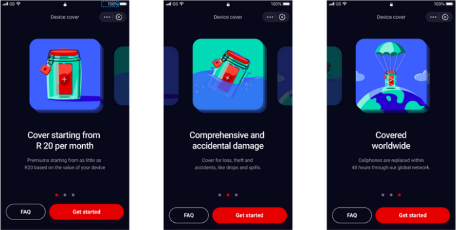
First time onboarding screens
When the user opens the Mini Program for the first time, include informative
onboarding screens to help the user understand what the Mini Program is about and
what the main features are. These are meant to give the user a quick overview of the
Mini Program and provides another branding opportunity.
Make use of between 1 - 3 carousel style screens to inform the user. If relevant, a FAQ button can be used to give users more in depth information, should they need it.
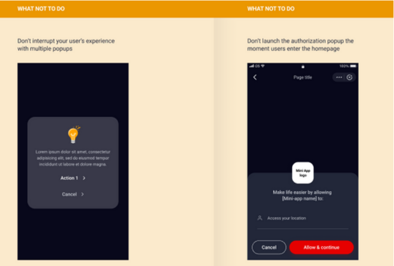
Popups and authorization prompts
You are limited to one popup on the homepage. The Authorisation 'popup' should not launch immediately. Launching the popup immediately as users enter the homepage can be annoying and distracting, so give enough time to ensure you don’t interrupt the use of the core service content.
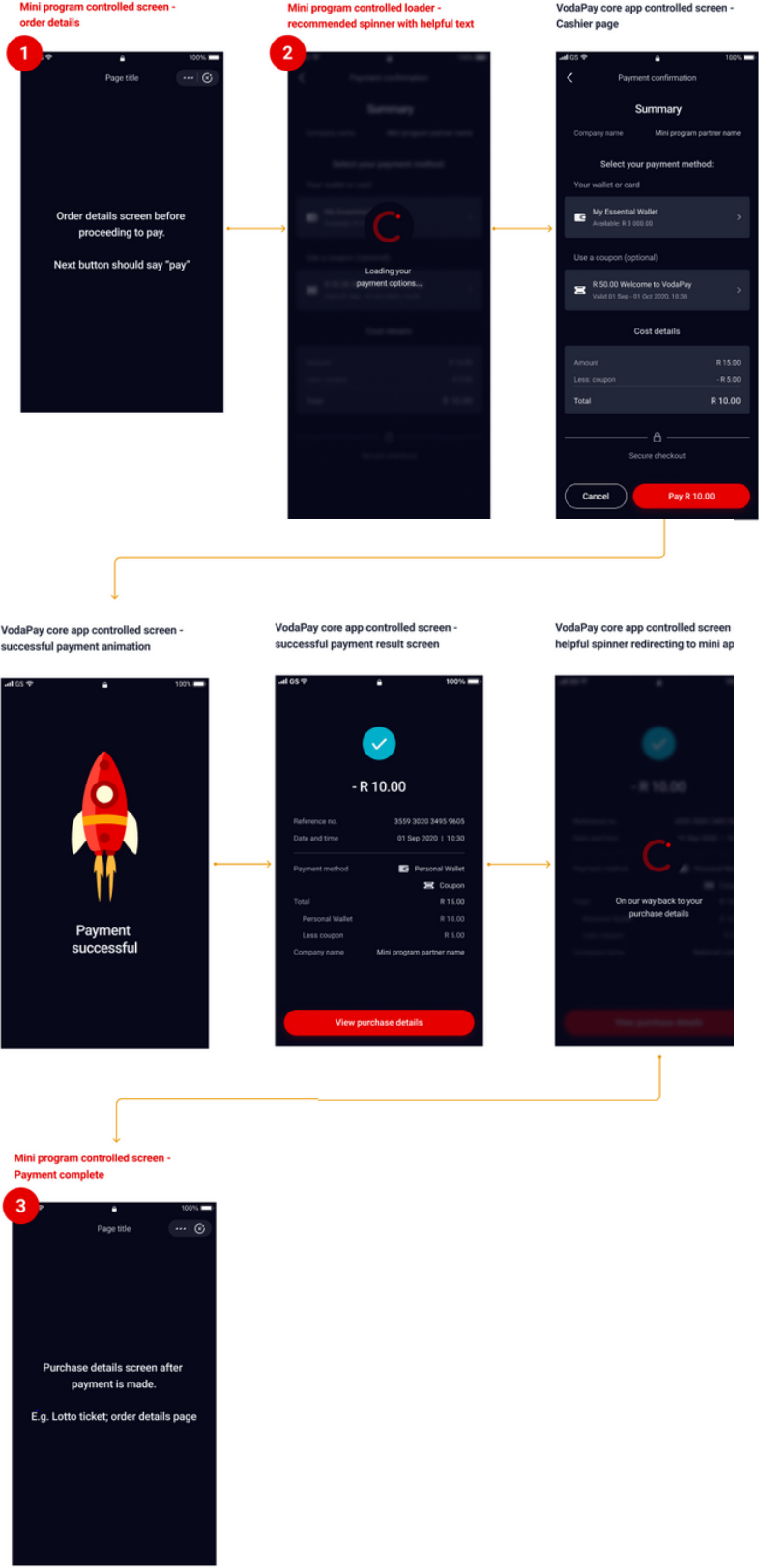
Mini Program payment flow
All Mini Programs must follow the below payment flow, to ensure consistency amongst
all services within the VodaPay App.
The specific screens that the Mini Program has control over have been highlighted
below, along with the screens that will be pulled in from the core app which the Mini
Program has no control over.
On those core app pages it’s important to note that:
- Only the information displayed for ‘company name’ will be configurable, and
- The coupon option will only show if coupons are available for redemption on that particular Mini Program.
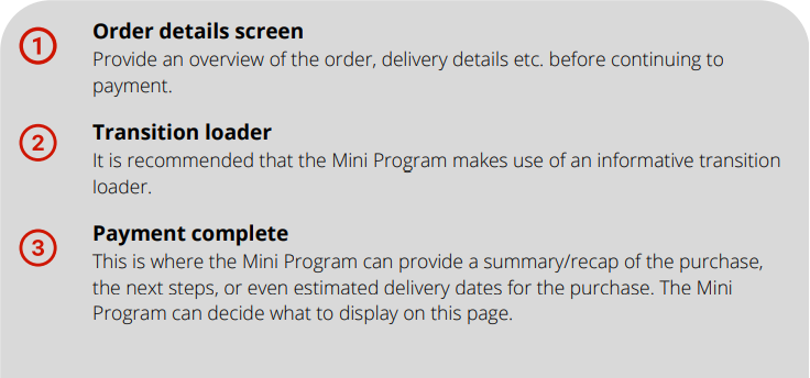
The following screens (indicated as nos. 1, 2, and 3 below) are controlled by the Mini Program in the payment flow:
Communication
Mini Program communication best practice
To keep the user experience consistent, communication should direct users back to the Mini Program, where relevant, and external links to other apps and websites should be excluded.
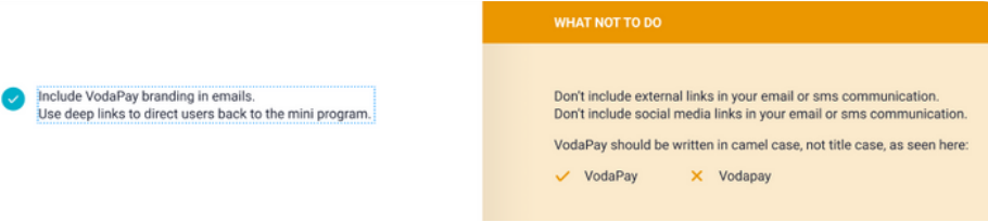
Deep links
Deep links are recommended to direct users from email or SMS communication back to
a Mini Program. A deep link is any link that directs a user past the home page of a Mini
Program to content inside of it. e.g. linking directly to a product.
A document outlining different deep linking options will be included in your communication guide email. Please reach out to the VodaPay mini programs team for further guidance, should you need it.
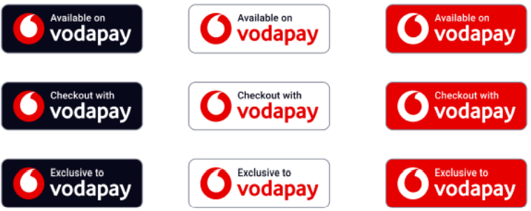
VodaPay branding
VodaPay branding should be included in your email footer. These badges will be included in the attachments of your communication guide email.